


")
")
")
")
")
")
")
")
")
")
")
")
")
")
")
")
")
")
As someone who closely follows the photos posted on BLP, I continue to be impressed by the work of members and the standards of photography, especially in this age of social media where great photography seems to be a rarity in a sea of very ordinary snaps. In this light (pun intended), I think everyone who entered should feel proud. The effort and commitment shown in your work deserves recognition and I can only encourage you to keep making the effort to get out among the birds, practice your photography and hone your skills both in the field and in front of the computer.
Not everyone can be a winner though. A degree of ruthlessness was needed even though this involved passing over some good work. The process I followed started with an initial run through all the entries to look at overall visual impact and check for obvious technical or compositional faults. This was a quick process to spot the obvious, not a careful analysis of each photo. This initial cut resulted in elimination of almost two thirds of entries. As I said, it was ruthless but worth remembering that in wider world of competing such as large, open competitions like the BirdLife Australia Photography Awards, it's likely this is how the judges are going to approach their task. A photo that doesn't make a quick positive impression is unlikely to get any further consideration.
So what were the issues I saw with shots that didn't make the first cut? On the compositional side, some common faults were:
- cluttered and distracting settings that I didn't feel helped me appreciate the subject;
- and the opposite: simple settings but where the bird was not doing anything interesting and engaging me in some way;
- subject size and position: too small, too big, simply plopped in the middle of the photo etc.
A common technical issue was lack of sharp focus and good detail. Sometimes this resulted from issues with focus in the field and some looked like softness from cropping too hard. Another common issue was poorly adjusted brightness and tone (too light, too dark, washed-out highlights, completely black shadows). Sometimes the photo just looked over-worked (too flat, too much contrast, too much saturation, really odd colours; generally didn't look natural).
For the shots that survived the first round, the next stage took more time and effort and involved a closer, critical look. This was primarily based on visual impact with my favourites being those photos that were visually interesting, well presented or told a story that sparked interest or emotion. This left me with about a dozen photos. Potential winners were considered and those that had significant compositional or technical issues were demoted to the commendation list or removed from further consideration.
Without further ado, here is my selection…
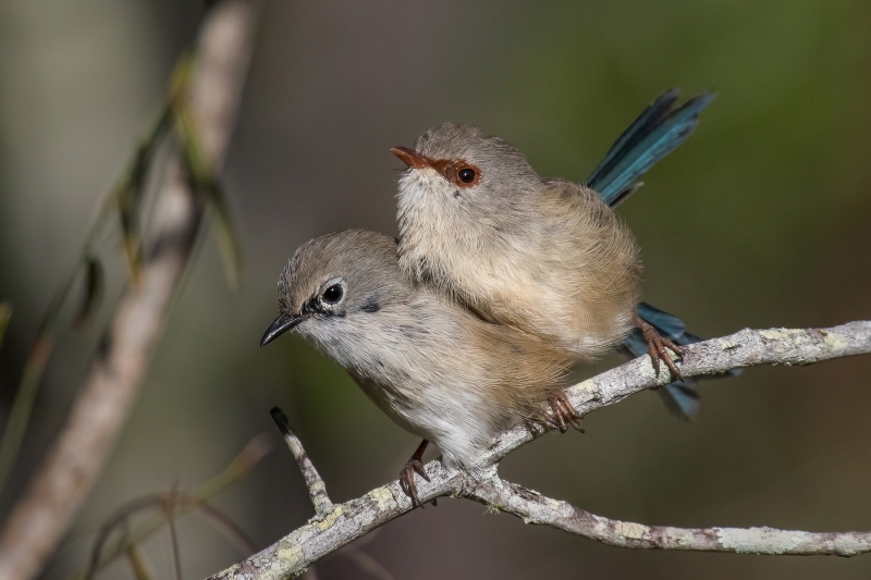
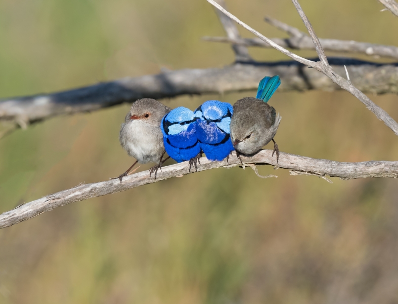
Winner: Variegated Fairy-wren, by John Eley (Image ID 48165)
There was a lot that I liked here. First, we had two birds, a male and a female interacting, not a single bird – most of the other entries were single bird photos. The pose was really engaging and told a lovely story about the affection between the two. Technically, it was hard to find any fault. Both birds were sharp and clear with well managed depth of field. Brightness, contrast, tone and colour all looked great. There does seem to be a small amount of digital noise in the background but it was not obvious or distracting. The composition was also hard to fault. The diagonal branch on the left is prominent but it is what it is and I didn't think it was a fatal flaw by any stretch. A truly wonderful and engaging moment, beautifully captured and presented. Well done!
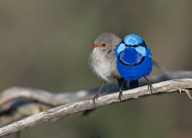
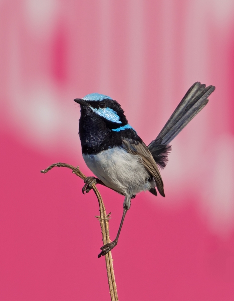
Highly Commended: Splendid Fairy-wren, by Jane Putland (Image ID 48111)
Like the winning shot, this one also had a male and female interacting in a delightful and engaging way. Technically it was very well handled with clean and sharp detail, good depth of field and well-handled tone and colour. I was less sure about the composition of this one, mainly the placement of the birds towards the right of the frame. The size of the birds looked good to my eye but the negative space to the left felt a little odd. There may have been no frame left on the right or maybe some prominent distractions but the photographer doesn't comment on the composition choice. All the same I felt it offered a great story about these two birds and wasn't far behind the winning shot.
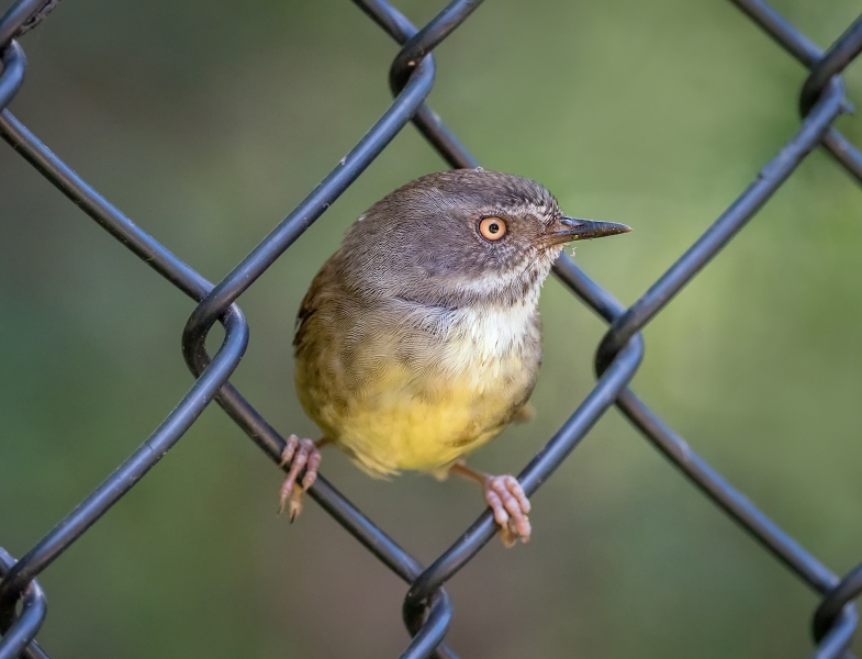
Commended: White-browed Scrubwren, by Michiko Iida (Image ID 48614)
I found this a visually powerful shot because of both the repeating pattern of the wire mesh fencing and the bird's pose with such strong eye contact with the viewer. Central placement of the bird in the frame I felt also worked well. Most of the time, I like birds in natural settings but this one was, to me, a delightful exception.
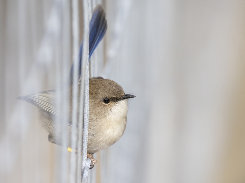
Commended: Superb Fairy-wren, by Graham Gall (Image ID 47896)
This is another photo in a non-nature setting that I also found very engaging. I especially liked the way the photographer has used the fencing to partly obscure the back half of the bird, creating what is almost a head-and-shoulders portrait but at the same time essentially showing the whole bird. The pale tones of the setting contrasted and showed off the darker bird extremely well, drawing my attention to the subject. The composition also looked very well balanced to my eye. Technically it was very well handled with no faults obvious.
Commended: Splendid Fairy-wren, by Jane Putland (Image ID 48286)
Like the winner and highly commended photos, this one had the bonus of multiple birds together interacting with one another. There was a lot to like with this shot because of the interaction between the birds and the story it tells. It would have rated more highly in my selections but for a few issues. I felt the birds were a bit too small in the frame and this gave more prominence to the multiple branches, diverting my attention from the birds. Technically, it was well handled overall except for some sharper tone and colour boundaries in the background (notably, above and behind the left-most bird). I was left wondering whether this was the result of the cloning the photographer mentioned in their comments, although I could be wrong. Nevertheless, I did find this a little distracting.
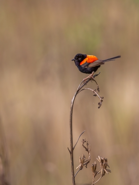
Commended: Red-backed Fairy-wren, by Greg Mcmillan (IImage ID 48402)
These are such beautiful birds and the photographer has done a great job capturing a shot of this brilliantly-bright adult male in breeding colours. I think the small-in-the-frame treatment works very well and help this shot stand out from others of the same species. It also shows off typical behaviour of these birds in their habitat. The composition is also very effective to my eye with the photographer choosing to keep a lot of the tall perch and placing the bird towards the top and right of the frame: roughly at the intersection of the one third lines (rule of thirds). The clean background helps make the bird and perch stand out. Technically it was well handled although I felt the bird was slightly lacking in critical sharpness but that wasn't very obvious.
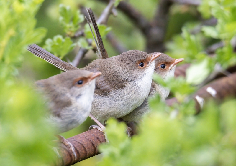
Commended: Superb Fairy-wren, by Ray St James (Image ID 48017)
I liked the way the photographer has used vegetation to effectively create a vignette or frame around these (super-cute) Fairy-wren juveniles. It's not a new technique but has been done well in this photo. Even though the birds aren't engaging with the viewer, I liked the pose. The birds may be looking towards a nearby parent as they all seem to be staring at the same spot and this conveys nicely their youth and dependence still on being fed by an adult. In a shot like this, it would be very difficult to get all three in focus. By having the middle bird sharp, I think the photographer has made the right choice. Technically, there is a little digital noise visible in the background but otherwise well presented.
Commended: Striated Grasswren, by Geoffrey Smith (Image ID 48321)
It was nice to see some photos of species other than Fairy-wrens in the competition. This photo of a Striated Grasswren was a great capture, with the photographer catching the bird mid-song on an attractive perch with a neutral and highly blurred background. The bird was sharp with great plumage detail and good tone and colour. The only technical issue I could spot was some dark bands around the branches. I suspect the photographer has tried to selectively darken the branches but 'overshot' a little. By going a bit wider than necessary, this has also darkened a band of background around the branches. However the effect is subtle and something I didn't notice initially.
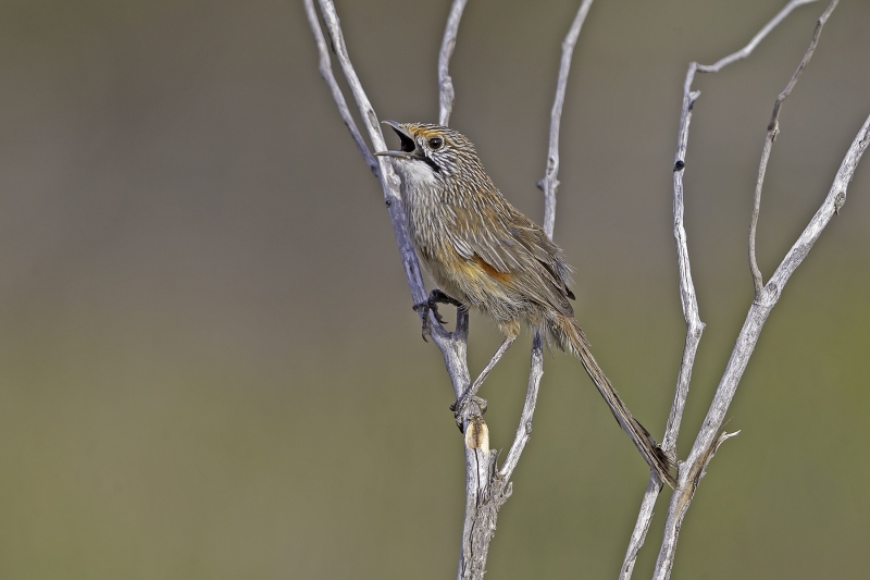
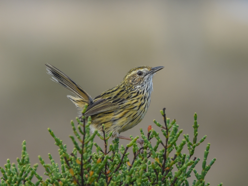
Commended: Striated Fieldwren, by Gary Cousens (Image ID 48495)
I enjoyed the photographer's comments on this – hours spent unsuccessfully searching for this species only for one to pop up around the carpark on the way home! I can relate to that. It was also good to see another species outside the Fairy-wren group. The setting is great with clean background and nice perch. The bird looks like it's about to break into song (or has just finished). It would have been a bonus, like the previous shot, to have it mid-song but it's still an attractive, well-captured and processed photo of this species and worth my commendation.
Commended: Superb Fairy-wren, by Bruce Mcnaughton (Image ID 48292)
This photo stood out because of the bold colour-contrasting background chosen by the photographer. It helped it stand out from the other photos of this species for me. It's also one where I also enjoyed the photographer's description of the odd looks he got from the road crew whose sign he'd used as a backdrop! All I can say, is that it was worth the trouble. The only thing I'd consider changing on this is to try compositions where the subject wasn't dead centre of the photo; but it's an eye-catching photo and also worthy of a commendation.
")
")
")
")
")
")
")
")